People often ask me how I got into design.
As far back as I can remember, copies of Architectural Digest were always laying around house. Stacked in the bookcases of the wood paneled library with the white spines and black lettering. The collections dated back for years. Even at an early age these magazines seemed important. I never had to ask why they were special. I could just tell. As an only child, there were times when I had to occupy and entertain myself. Most kids my age were not interested in the same things as I. What was it about these magazines that so fascinated me? I would spend hours studying room layouts, learning about famous designers and different styles. I did this for years and really thought nothing of it.
Years later recalling these happy memories, what seemed like wasted hours and days actually somehow turned into the early beginnings of my design education and career.
As I think of the days of flipping through the pages of Architectural Digest, it is with great amazement and gratitude that I now find myself featured in Architectural Digest.
Speaking of dreaming: this all came about by the wonderful and talented writer: Patricia Shackelford (aka Mrs. Blandings). I had mentioned that I was redesigning a few things around my apartment and, voila, an article came from this.
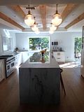
I am happy to share some new images of some of my latest edits and changes of my own apartment. Thank you ever so much to Patricia for this and Margaret Russell and everyone at AD for making this happen. You have shown me that dreams do come true.
You can view this article online at: Architectural Digest
Make sure to check out many of the great articles. The newly updated website has wonderful
features (including Design Talk) everyday!
I hate to mention the still rather dreary economy (let’s hope it’s on the upswing), but it does affect a lot of people who want either more space or perhaps a little less. San Francisco designer Grant Gibson is often in the spotlight as a young designer to watch. He is known for a crisp and classic aesthetic—one that could include a Lindsey Adelman chandelier as easily as a classical urn. Despite his success and growing portfolio, he has decided to stay in his modest rental a bit longer, shifting perspective rather than moving house. So I thought I’d ask him for advice on upgrading a home you don’t actually own and how to get the best return on your investment of time as well as money.

Gibson does not want to give up his Presidio Heights location—“I walk to everything,” he explains—but he would like more space. “I dream of taking one of these houses with a peaked roof that has attic bedrooms and blowing them all out for a master.” But not quite yet: The designer has decided that waiting another year makes the most sense. Still, after being in his current spot for the past seven years, he wanted to make it feel new.
“After the apartment was published [in The New York Times], I became a little tired of the whole look,” he says. Which is not to say that the look was tired. Gibson’s apartment was detailed and layered, each surface carefully styled with glass, books, and objets. “I wanted it to feel younger and fresher—I wanted to interject more color,” he notes, while creating a cleaner, less-cluttered look. “When I look back I’m shocked at how much stuff I had out. My living room and dining room resembled an antiques store.”

Gibson feels that his home is a laboratory for his work. “I can play with my own space more than I can with my clients’, though they seem to be asking for more color, too,” he says. “Also, I won’t be here forever, so I feel like I can have some fun with it.”
At the same time, Gibson—like anyone living in a rented apartment—didn’t want to feel that he’d overspent on renovations to a space he doesn’t own. “With a rental, you have to think of how you spend money in a different way,” he says. “I had had some thoughts of changing the Formica countertops in my kitchen to marble, but I realized it wasn’t the best use of my money.” As it turned out, minor changes, especially in the living room, made a big impact.
He started by editing to make the space feel cleaner and more modern, replacing the living room’s dark Oriental carpet with a lighter sea-grass rug, for example. He also got rid of the glass-topped brass cocktail table and replaced it with a pair of versatile square faux-tortoiseshell Parsons tables. Then he began stirring in color. “I do like a neutral base, which makes it easy to change art or pillows and accessories.”

Gibson decided to keep the walls white, but he changed the living room’s built-in bookcase to a charcoal gray, using Farrow & Ball’s Down Pipe. “To me, splurging on paint like Farrow & Ball didn’t seem like that much of a stretch,” says Gibson. “A couple of gallons of good paint doesn’t break the bank.”
The bookcase, once home to layers of pictures and objects, now holds simple stacks of books, and a graphic convex mirror has replaced an old master-ish portrait. “My design books are there, along with some auction catalogues,” Gibson says. “I actually use all of the them—I’ll pull books out over a glass of wine to look for inspiration.”
The next step was an infusion of contemporary art, which adds bursts of life where dark and serious portraits formerly reigned. A vibrant oil—an unsigned thrift-shop discovery—joins the conversation at seated eye level in the living room, while a painting of colorfully clad spectators peers out from between a pair of brass obelisks on a Biedermeier secretary.

For his fabrics, Gibson opted for solids or for minimal pattern, as with the Greek key pillows on the sofa and, in an alcove window, a French dining chair with custom leather upholstery the color of a shiny geranium leaf. The powder room, meanwhile, has leapt to life with a coat of Farrow & Ball’s Charlotte’s Locks, a vivid orange. “Neutrals can be one-sided,” Gibson notes. “I have been pushing myself. I am inspired by other designers who use bold colors. While I’m drawn to history, I like to take a fresh approach.”












16 comments:
Congratulations! Great article with so many useful ideas. Wow wonderful job.
I still have that article from the NYT tucked away for inspiration. I know that I can find it online, but I've kept it because of the feeling it generated when I first saw it. Now you have inspired me again. I have a pretty room full of pretty things that might be a 2nd or 3rd cousin to your original space. I use it every day, and know that it is time for a change. I want it to feel fresh and young. You have given me the "kick' I've needed to make it happen....thanks....k
Dear Grant,
Bravo on a wonderful article in AD. Of course I adore your design aesthetic. Plus I am so thrilled that Patricia, who is also from my hometown Kansas City, wrote the article!
xoxo
Karena
Art by Karena
I lived in Russian Hill when I lived in San Francisco, but Presidio Heights was my absolute *favorite* neighborhood and definitely would have moved there, had I stayed! So, I'm envious! What great shots of your apartment - I love your style!
Congrats! It is well deserved. You brings such passion and love to your work- it was what you were born to do!
Wonderful! Congratulations!!!!!!!
Sent from my iPhone
Amy
Hi Grant,
What a great article in AD! Thanks so much for sharing it. I loved it! You are so talented!
Hope you are doing well.
Hugs,
Karen
A million congratulations. I have loved seeing how your apartment has evolved over the years. The newest rendition is superb. I also love seeing your featured design projects and classic design aesthetic--that deep green dining room is engraved in my memory. Mary
congratulations on the AD feature! Like you I grew up flipping through stacks of Architectural Digest on my parents' coffee table, and I was thrilled the first time I saw something I'd done featured inside (though my name was not mentioned as I was only the painter, not the designer) Your apartment looks stylish and real. Bravo!
Congratulations! You are so talented! N.G.
grant, what a wonderful article. i love how you have updated your already-lovely space. you have such wonderful, refined taste and such beautiful things.
that green chair is sharp! did we see the orange powder room? that down pipe is great. i am soon painting my office in one of their grays (tbd).
xo terri
Wonderful article and the apt. looks great. I esp. love the child's painting.
Hello Grant,
Always a pleasure to follow your adventures. Congratulations on the AD article... such a great topic since many of us rent in our big, beautiful City by the Bay. I spend a lot of time thinking about how much I can put into our apartment, so I appreciate your ideas. I discovered F&B Savage Ground for our garden side back room... tranquil. Keep up the great work!
Sincerely,
Chris
GRANT!!!
YOU are an inspiration to me...
Congrats!!well deserved...
Xo
J
Dear Grant!
Congrats! Love your apartment. Paige published two of my "letters to the editor" years ago, and I met her in NY when she came to FIT to give a talk. I still have not met Margaret Russell, would love to, though. Was charmed by your post, it reminded me of myself, and also of a Warhol film, I think it was "Dracula" with a brief scene showing a little boy reading a copy of "AD" ! Trivia for 500 ! Ha ! Have a great weekend!
Dean
This looks fabulous Grant!!!! Congratulations. Hugs. Martha
Post a Comment