


After countless hours, weeks and months of preparing, it finally is here!
The house launched officially last Saturday morning (after a few successful opening parties).
For me the process was an important personal experience. It was seven years ago this week that I launched my interior design business after moving to San Francisco from New York. Seven years ago, I designed what was the smallest room in the house (about the size of a closet). My vision was called “A Gentleman’s Retreat.” I filled the room with old trophy cups, worn rugs, a wing back chair, and portraits from the flea market. I even had an antique French bird cage with my own yellow canary, who sang and entertained all of the visitors. After following up the subsequent years with an all black and white room and then a master bathroom and dressing room, I took off some time from doing showcase houses. I must say that I really missed the process.
When I look back and think that it really wasn’t that many years ago that I started in San Francisco, and in that short amount of time, I have been fortunate enough to be given a much more prominent room this year – the dining room.
In the years since my first showcase house (on my VERY, VERY shoestring budget – for which I took a personal loan from family friends to make happen) , I have learned, grown and evolved into my own skin as a designer.
I take chances and have more confidence. My travels around the world have proved to be a priceless education in which I have been exposed to history, cultures and inspiration. Really, do we ever really stop learning and growing as people? I know that I will ever stop learning as a designer. That is part of why I love what I do so much. My days are so varied and I have the opportunity to work with people on all kinds of projects that push me to the limits, challenge me, and allow me to grow.
Some people that have come into the showcase and seen my design have been amazed that I have put such bright color and juxtaposed classic pieces with modern pieces. I love pushing the limits and striking a balance with mixing materials and styles. I honestly do a lot of work with bright colors as well as mixing styles. I have done stark modern and bright colorful houses that make your eyes pop.
I think that I get associated with being a neutral-toned, classical designer.
So it is thrilling for me to show the world that there is a different side to my work. I feel like my work is still very classically based - I genuinely think that is where design begins. If you know how to design using classic styles, then you can play a bit more and mix things up.
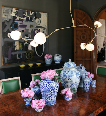
For this showcase dining room, I was trying to strike a balance with color, texture, materials and styles. I wanted to create a background of grey by painting ceiling to look like fog (which rolls over San Francisco every afternoon), and applied grey grass cloth to the walls.

This is the BEFORE shot. The space had a mural that was in very bad condition and sadly could not be restored.

First coat of white primer before the tined grey primer

Making progress

Grasscloth going up

Hand painting the ceiling to look like fog
I took a graphic approach to the design of the floor, which helped to keep the space light, open and airy. I selected a octagon pattern for the floor (3 feet in diameter.) My decorative painter Katherine Jacobus painted the floor white with layer after layer of white deck paint and then hand taped out the pattern on the floor. I am a huge black and white fan. White brightens the room while the black grounds it.

The first step was to sand the floors

Testing the paint for the floor
The pattern is based on a design from a floor from an English country house that I visited a few years back (I mentioned that I influenced by my travels!). When I saw the floor, the pattern was done with wood tones and the pattern was inlayed with a darker wood. I definitely see how designer David Hicks got his inspiration for his graphic patterns.


From sketching the pattern, taping it out and applying layers of black paint
The next part of my design was finding a table large enough to fit the space. The table is 10 feet long and almost 5 feet wide. Massive. No matter where I looked, I just couldn’t find something big enough.
I was inspired by walnut burled wood, Milo Baughman and playing with a 1970’s sort of look. We started with our furniture builder (Berger Design Build) on the design of the table, and quickly learned the sheets of burl in the size that I needed would be a rare find as well as extremely expensive . (For those of you that don’t know how a showcase works with the pieces of furniture: typically designers invest their own money into projects, or can borrow pieces from vendors) We opted then to build the table and then faux paint the entire table to look just like wood! (Hours and hours of labor, coats of paint and details!)


The table under construction


Painting of the table
I worked with the amazing Lindsey Adelman studio in New York to custom design and build a huge fixture to hang over the table. It is made of solid brushed brass and hand-blown globes. I loved the organic feel in its shape, industrial, but refined.


Installing the light fixture
I then decided to play with classical pieces, like the blue and white Chinese ginger and temple jars. I added a pop of pink with beautiful peonies. It is hard to see from the photos, but my window treatments are a dark navy blue (cashmere and wool blend) that really relates to the blue of the jars. They are so luxurious, my drapery workroom (Madina Aryeh Custom Workroom) and I were ready to wrap ourselves up in them many times. I really love a comfortable dining room chair (nothing is worse than sitting at a dinner party and being stuck in a bad chair), so I went with a Louis XVI style chair and left it in raw wood form and then brightened them up with a bright Kelly Green leather with an antique nail head detail.

Louis XVI chairs waiting for the green leather

Shopping for blue and white


Moving in
Lastly, I was honored to work with a fabulous collection of very important modern art from the personal collection of Foster-Gwin in Jackson Square. We selected a Woelffler, a Lobdell and pair of Gechtoff. I am not really one to pick art to match a fabric or sofa. I don’t really understand that concept. What I do know is that this group of art somehow looks like it was made to fit in this space. Somehow the colors and textures just work all together with each other and in the space perfectly.
Overall, I am thrilled with outcome of my room and thought that you would enjoy some of the behind the curtain details with some of the process photos of how it all came together.
I am thrilled to share this project with you. This feels like thinking about traditional in a whole new way. This is not the way your grandmother lived. Keeping it fresh and juxtapositioning styles that creates a update style that seems very today.
I can’t thank all of my vendors and design assistants enough.
It takes a team of people to make this happen and run a busy design firm.
You can visit the house until May 30th. For information visit: decoratorshowcase.org
Since 1977, the annual San Francisco Decorator Showcase has benefited San Francisco University High School's financial aid program, raising nearly $11 million in its 33 years.











28 comments:
Such a great room, Grant. I love the mix, such an artful combination. That light fixture is just fabulous. Congratulations on a wonderful job!
Hey Grant! I LOVE your blog and all of your interior design work and inspiration! YOU are an inspiration to all interior design "junkies!" :)
Look forward to seeing more!
BTW, Happy "Mother's" Day!
Jon Chapman
Atlanta, GA
Congratulations on your achievements, beautifully done…and very chic!
Really outstanding. As you described, I love that you continually challenge yourself. Although each of your designs may have a different aesthetic, they all share the hallmark of beautiful and inspired design. Loved this post & the dining room! Congratulations.
Loved every inch! Congrats!
xo,
cristin
Grant, what a lovely job you have done with your latest showcase project! Thank you for such a "from the heart" post. Saw you at SFDC the other day but didn't stop to introduce myself. Best of luck and continued success. Shiree'
WOW!!! How's the one in NYC going??
xo
Holly
Great! Love all of the detail.
Suzanna
Sent from my iPhone
Great room!!!
Karen T
Grant,
At risk of sounding like an overexuberant lunatic, you take my breath away.
I'm aimin' for my interior design M.F.A. at the Academy of Art here in town, and sometimes I find myself feeling like the design community is a bit too snooty, stale, and mired in convention to merit a follow-through on my financial and emotional investment. So thanks, once again, for slapping some good sense and glorious inspiration into me - yes, good design exists without being too pretentious, without the restraints of rules, and with a great dose of playfulness! And this reminder during finals week, no less!
A few exceptional notes: your table and your light fixture. Grant, I am a huge fan of burled walnut too, and like you, am dismayed at its expense and rarity. I would never have thought to do something like this - so, bravo and three cheers for your inventiveness. Secondarily, I must add that your light fixture took my breath away. Utterly. Its lightness is like an orchid's, and it's just delightful. Love the contrast that it adds to some of the room's heavier elements.
'Til next time -
CR
I am going to paint my porch floor like that! Love it.
Such a beautiful room! Live it all, but the light fixture is especially yummy.
Awesome room, congrats!Great blog....
This is perfection Grant. I love everything about it, everything! The grasscloth, the blue and white, the Adelman fixture, the dining chairs,,,the artwork, the peonies, the graphic floor. It makes my heart race its such a masterful mix. Congrats!!!!
It's simply great...all of it. The color is a favorite of mine and I especially love those chairs and how they're mixed with the blue and white on the table...not to mention that light fixture...fantastic...congrads...
www.ajbarnesonline.blogspot.com
Dear Grant!
fantastic!
Am sure you will get some major clients from this...I LOVE this dining room! It has all of the elements that speak to me. You deserve a huge spread in AD for this one! So impressed, and again congrats on a job very well done,
Dean Farris, Designer
Love the story about you and your process, the room is fantastic.
Nice...your work is always intriguing.
Grant - it is just wonderful. I only wish that I could see it in person. Congratulations.
Wow that was totally amazing makeover! I love the light fixture and the table, the floor too looked gorgeous. Wonderful.
Grant! It's sensational.
It is so exciting to see your evolution. I just love the green chairs, the navy you worked in, the bold forms, the classic Chinese blue-and-white, the gutsy art -- the peonies!
Congratulations and thanks for taking time to share your process.
Cheers,
Courtney
Amazing room! all the bassic elements have been re evaluated and the final result is brilliant!
Thank you for an inspirational room!
Alan Karlin Design
congrats on a beautiful room. it definitely speaks to your talents and displays a new direction in your skills.
Grant, its to DIE for!!!! It's one of those blog posts that make heart do a "beep beep" as my 5 year old puts it! Congratulations. xx Ali
It looks great Grant, congratulations! Its a great mix. I would never have guessed the table wasn't real timber, AND I love the artwork. Well done.
We just visited the showcase house: LOVED your dining room! I never thought I would like ginger jars, but you've convinced me. Congratulations on a fabulous space.
I went to the Showcase today. The dining room was one of my favorites. Great job!
Grant sorry to be away so long. I adore seeing how your room came together from start to finish! Fabulously!
xoxo
Karena
Art by Karena
Do Come and enter my Great Giveaway from Serena & Lily!
You will love it!
Post a Comment