
I mean seriously there were 25 pillows!
I guess I wanted it to look full and pretty for the photos- but in reality do you really NEED all of those pillows. If I look at the photo- it doesn't even look like you can sit down as it is ALL pillows.
So I have edited and paired down and now I am much happier.

What do you think? Too many pillows? Do you like this current shot with an edited grouping now?
Let me know what you think!











38 comments:
Grant, I can't even concentrate on what you're asking because the Pillow Talk theme song is running through my head -man I LOVE that movie!
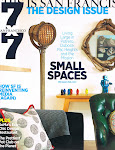
Oh, okay... so I say that the photo for the Times looks STUNNING! Yes, there are a lot of pillows, but it was a photoshoot. I love your edited every day take. Well done, kiddo!
".....Pillow talk, pillow talk. My pillow and I both agree, two heads together can be better than one....."
While pillows look so nice I have seen so many sofa's that are so full there is no place to sit and then what do you do with them? I have very deep sofa's but when I want to really settle in I throw the pillows on the ground and sit back and relax.That being said I love everything you do pillows or no pillows.
i agree with scott.... it was a photo shoot, and your home looked beautiful...
if i had to live with that many pillows, it might drive me a bit crazy though! i think they would be falling everywhere, or I would be moving them from corner to corner everytime I sat down!
I have to admit when I saw the "line up" the very first time...I was wondering how you could stand it...how many ended up on the floor, tossed over to the sofa, or crushed by somebody's bottom!
It's kind of like the whole bed pillow thing...all of us in design are fabric addicts and we all want a really good photo, and then real living creeps in and the word "edit" does become such a wonderful reminder.
Acanthus and Acorn:
LOVED how you worded this.
It is so true with the bed pillows too!
I'm all on board with tons of pillows on the built in. For a tall man like you -you don't need a lot of support to reach the back comfortable -but shorter people (like me) need a booster! ha
Don't get me started on pillows on beds -the practical architect in me gets super upset about it! If you don't use it, why do you need it? Just have the pillows you use be beautiful! I do read in bed though and believe in a FEW accent pillows but we've all seen people who go overboard.
If you're comfortable with less pillows -then go forward that way. it's your house and you should be happy with it!
Hi Grant, I must admit from a purely visual standpoint, I like all of the pillows! However, for reasons of practicality, it was a good idea to pare down the numbers. The newly edited vignette looks beautiful!
I'm somewhere in the middle, because I see your point about having too many pillows (although it looked great!) But the second photo looks skimpy to me.
Guess that's not very constructive, is it? LOL
I think it's fun to move things around - nice update! :)
No! I love the first shot, especially the table and for a photo shoot it couldn't have looked more fabulous, maybe a few less pillows for practicality, but the again who am I kidding keep it the way it was, gorgeously divine!
Without the Uncle Beefy portrait pillows I've really nothing to comment on now do I? ;)
I'm a sucker for an uber-plush, over-the-top collection of pillows! But, like MaryBeth pointed out when there are so many what do you do with 'em? Maybe, make your guests sit on them on the floor so they continue to look up to you! ;)
Grant you have amazing taste, I think for a photo shoot it looks amazing but for everyday life it is probably more convenient to have less. Do the first thing in the morning test. Look at it first thing when you wake up and see if it feels too sparse or too many. That test always works for me because your mind is clear in the mornings and not full of images as the day progresses it gets full of design jobs,color,pattern so it is hard to judge later in the day. I call my pillows toss pillows because they are tossed on the floor when I go to sit down, Have a great day! Kathysue
The photo shoot made your home look absolutely wonderful. I thought there were too many pillows and it made the window seat cushion disappear making the area less welcoming and too fussy. Also, there is no way to tell about the textures in the photo to make the grouping seem more interesting. Maybe one punchy pattern in the new smaller grouping? I'm an urn person so the urn with the branches gives height to the middle void in front of the bay window. How 'bout less pillows, same urn flower/branch arrangement?
I understand the editing for everyday, but the photo for the Times was visually stunning! I liked the table in the photoshoot as well. You're so gifted and the pillows took your banquet out of the everyday... that's why you were in the Times!!
I am thinking I love the loads of pillows look, if they are stuffed with down inserts they become what I call "grown up teddy bears"... lovely to cuddle into, I vote for more is more and use down inserts for sure...
Great design is practical design. To quote Jamie Drake ,"glamorous design is about 1st being comfortable."
Jessica Bennett
Design Principal
Alice Lane Home Collection
www.blog.alicelanehome.com
Great design is practical design. To quote Jamie Drake, "Glamorous design is 1st about comfort.". I vote less pillows. Great question.
Jessica Bennett
Design Principal
Alice Lane Home Collection
www.blog.alicelanehome.com
Looks great, now tell me what color the floor is.....please. Love your blog! Thanks, Judi Wallner
Sent from my iPad
Judi-
The floors are a mix of ebony and walnut together with a matte finish on them. Hope that helps!
The edited look is much better but I did like the branches.
Lynn
HI Grant
I've been following your blog for a while. I grew up in Berkeley and Piedmont and so you being in SF is an additional bonus for me.
I saved screen shots of your apartment as I LOVE your design style. I'ts actually pretty close to what I'm aiming for in my house. I love color---but I keep wanting , at least in the living room to go all neutral. Woodsy and neutral. Whenever I look at interiors, I'm ALWAYS attracted to that palette. I"m not an interior designer by trade, but do home fashion and accessory design and illustration . Sometimes I think I should have majored in interior design in art school , I love it so much.
Anyway, I do like your banquet with the fewer amount of pillows. But you know what? I like your table with all the extra stuff on it. Or did you remove it to better show us the effect of fewer pillows?
Best REgards,
Sudi
Hi Grant,
In total agreement about the grouping and downsizing of your pillow arrangement. So much better!
Best,
Wende Cragg
I like all the pillows and all the pieces on the table. Looks nice and full
eao
I love pillows and I love, love, love your design style but I must admit that the first photo looks a little bit like a size 12 woman trying to fit into a size 8 dress. It was a little squished. Although the pillows are all lovely and I think they were lovely for the shoot I like the whittled down version a little more.
Grant,
My vote, for what is worth, is somewhere between the old and new look. I found the edited version too stark. The plethora of soft, cushy pillows soften the edges of all the furniture. The original tablescape has more architecture than the latter. That is MY two cents! I find all your work refreshing and creative and immensely enjoy your photo editorials.
Judith Auclair
Grant, I have followed your work since you moved here to San Francisco and you have evolved over the last couple of years. I think the pillows are fine (back then). It is all about editing now. By the way, you have great style, love the blog, and loved the photos of Derbyshire. Keep up the good work. YOU'VE GOT IT!
No, Grant, don't do this to me. No. I need my pillows. I need all of them. All eleven-twenty-dozen of them. Even the ones that don't match, except in my imaginary OTHER home. Even the ones that are older - they'll be worth a TON someday, I just know it! Even the ones that are completely out of style. Have you never heard of compassion? Am I just going to throw these poor orphans out in the cold? Even the ones that are just like those other ones over there - yes, the 3 zebra ones. And the virtually identical green ones. I ask you, who else will take care of these pillows if I don't?!!!?!
-SF
P.S. Your living room is lovely :)
I liked the table before...
dont be so hard on yourself! i think as Scott said - most people can understand why you did it and at first glance - it just makes you want to sit there and read - practicalities only come later and with middle age...
Much, much better. Your probably off to London now. Can't wait to see your pics. If you get a chance check out my new blog. I think you will like what you see. Thanks.
Agree fewer pillows is more real. Though both images are terrific. But I miss your branches...
I really like the first image but of course less pillows make life easier. I had a post with the same subject a few months ago, inspired by one of Joni's (Cote de Texas).
It is always an interesting subject.
I actually like the overabundance of pillows if the seating area doesn't see much traffic.
For the photo shoot I loved all of the pillows, for real life I'm a fan of the edited collection...needs musts after all.
I wonder if you could find (or have made) longer pillows (with contrast welting) -- perhaps ones that could sit up on their own -- with slightly wider bases? (if you looked at them sideways -- they would be a triangle -- so they would sit nicely at that lovely window) Maybe monogrammed? Or with a handsome silhouette Regency figure?
Jan
Please...you're being disingenuous. You believed in it at the time; don't ask us to wipe the memory banks clean for you. Life is a progression and taste evolves. Never hide from what you liked in the past; honor it and appreciate the ability to move on. One day you may decide that 25 pillows is the definition of chic - how will you then reconcile your taste on May 3, 2010?
As a photoshoot it does look stunning even with all those pillows. I find my eyes darting
down towards the rug which immediately points me to all those pillows. In practical sense
I wouldn't have so many though.
John Taylor,
window blinds liverpool quick tips on selecting the right shape and styling your room
Hi Grant: I love the look of less pillows. It looks more comfortable. M.H.
Post a Comment